Useful Tips for Adobe Camera Raw
Below you'll find a small selection of tips you may not have have heard of, all of which I utilize during my own post processing while working in Adobe Camera Raw! It's likely that a good portion of this will also transition over for those of you using Adobe Lightroom. I really hope these will help you streamline your editing process. Leave me a comment if there are any other topics you'd like me to touch on in a future post!
Double Check Your "Workflow Options"
First and foremost, let's make sure your Workflow Options are set up properly, giving you the best starting point to make your images their best...
Accessing your Workflow Options is very simple. When you open an image into Adobe Camera Raw, click anywhere along the text you see highlighted above. This will open up a menu with lots of different options. We're most interested in four of these...
My recommendations are as follows:
Ensure your colour space is set to "Adobe RGB"
This is a wide gamut colour space that will allow the full range of colours that your camera captures to be retained and put to good use as you go about editing your images. This is commonly set to sRGB, which is a far more restrictive colour space, used by web browsers to display images online.
Leave Image Sizing set to Default
This will retain your camera's native resolution. Image resizing should be done later on, once you have saved a master file in Photoshop.
Set Resolution to 300 Pixels Per Inch
This is the industry standard for both printing and stock photography. It's always best to start with a full resolution master file that you can downsize and output at lower resolutions for web later on.
Change "Depth" to 16 Bits Per Channel
This often overlooked setting can potentially make a noticeable difference in your post processing. Let me provide a brief explanation...
A "Bit" is a computer term relating to data storage. Described here as "Bits Per Channel", what exactly does that mean in practical terms? Well, more "Bits" = more potential colours available to us. When working in 8 Bit, we have available to us 256 different values of Red, Green and Blue. Compare that with 64,536 of each when working in 16 Bit. When combined together, 8 Bit gives us approximately 16,800,00 different potential colours, whereas 16 Bit provides literally trillions of different colours. When considering the fact that our eyes can only differentiate around 10 million colours, working in 16 Bit may seem valueless. This begs the question, why use it?
The difference between the two can at times become apparent when making more considerable changes to your images in post. Strange graduations in colour known as posterization and other artifacting can sometimes appear, resulting in a very unnatural look. Given the large increase in information we're working with, these effects are encountered much less frequently when working in 16 Bit. This comes highly recommended by some of the most fastidious photoshop gurus and print makers in the business. To be honest, though I do enable this to be safe, I have a tough time producing discernible evidence of this during my normal post processing, but perhaps for those making more dramatic adjustments to their images or those making very large prints, this may prove to be very beneficial.
Remove Chromatic Aberration
First of all - What is chromatic aberration?
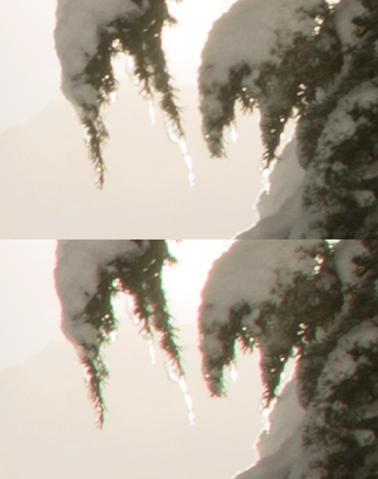
To explain things very briefly, chromatic aberration is an optical effect resulting from the lens' inability to focus all wavelengths of colours to one point of convergence. The most prominent visual effects of this are colourful edges that appear in areas of high contrast (often known as colour fringing). This issue usually becomes more noticeable as you move towards the corners of the frame. Certain lenses outperform others in this respect, and the problem can be at least partially mitigated by stopping down your aperture.
Though the effects can be negligible when viewing your images small on the web, they're often especially noticeable in print or when viewed on large monitors. It's amazing the amount of professional work seen in otherwise very high quality prints and books blemished by what would've been an extremely quick fix!
Thankfully, there is a tool in Adobe Camera Raw that will help to minimize these effects with as little as just one click. I enable this feature as a default setting so it is automatically applied to each image - learn more about how to do that later on in this post...
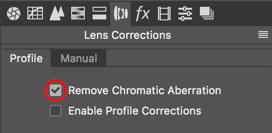
In the Lens Corrections Tab in Adobe Camera Raw, click Remove Chromatic Aberration. More comprehensive options can be accessed in the "Manual" sub menu. Check out the images below to see how this tool can really help out with this issue.
Keep an eye on each animated GIF below to see the BEFORE/AFTER...
A scenario where chromatic aberration is commonly seen: the edges of a backlit subject, surrounded by much brighter tones. Even with very high quality lenses, there will almost always be some visible colour fringing in areas of high contrast, such as this.
Though this effect is often more pronounced in wide angle lenses, wildlife photographers shooting with longer focal lengths certainly aren't out of the woods! Take a look at these next two examples...
An extreme crop of an image depicting a family of Common Loons, silhouetted by early morning backlighting in the before image shows red fringing along the outline of the parent and chick.
In the before image of this second crop of a Common Loon image, one can see that the high contrast areas of the bird's plumage have fallen victim to the dreaded chromatic aberration.
Utilize the Highlight & Shadow Clipping Warnings
A good way to establish contrast in your images is to reintroduce a wider range of tones, some of which may have gone missing in your raw file. I find that using the White and Black sliders to be the most precise way of establishing this, without blowing highlights or losing details in the shadows.
An old adage you may have heard, especially with regards to black and white photography, is that all photos need to have a full range of tones, from pure black to pure white. Of course this can't always be the case if you're hoping to keep your images looking natural. However, for situations that call for it, this can be an appropriate option. Take for example the Loon image below. Pure black and pure white do in fact exist naturally in this scene.
By utilizing the Highlight and Shadow Clipping Warnings, I'm able to establish my white and black points, without the risk of losing detail in the lightest and darkest portions of the image. In certain situations, I don't mind having even very large areas of pure black or white in the image, but typically, I prefer to retain detail throughout. Here's how to be sure of that...
To enable these warnings, click on the triangles in the top corners of the histogram found in the upper right hand portion of the screen. Once these have been selected, blown out pixels of the images will now appear as red, and blocked up dark pixels will appear as blue. If I'm hoping to increase the amount of detail in the brightest and darkest areas of the image, I'll often bring my sliders just to the point of clipping, then back them off slightly.
Below you'll see examples of blown highlights and blocked up shadows, with the corresponding warnings illuminated.
Sharpening Masking
Though my serious sharpening is always done right before output and is dependent upon the image size, and the file's intended use (e.g. web presentation, large prints, etc), I apply a very minor round of sharpening in Adobe Camera Raw, with my default settings visible below (excluding Masking which will likely differ from image to image).
The "Masking" slider (highlighted above) is a very useful tool that is often overlooked. It allows you to remove areas of the image that you do not want sharpening applied to. In the case of the image below, there is no detail in the background to begin with, so all sharpening will accomplish is introducing more noise to those areas, which is of course undesirable.
By holding the "Option" key on a Mac ("Alt" on PC) while adjusting the slider, the mask will appear, showing you which areas are being affected. Black = No Sharpening Applied. White = Sharpening Applied.
Set Custom Camera Raw Defaults
I encourage you to treat each image as its own, and to shy away from using presets that apply the same colour/contrast adjustments to each image. With that said, if you find yourself frequently using a tool or adjustment within Adobe Camera Raw, you can save a custom Camera Raw Default that will retain each change you've made to the image and apply them to any subsequent image you open in the program. This can really help expedite the editing process, and can help ensure you don't forget any steps.
By clicking the small icon in the top right corner of the sliders, with any tab open, you can navigate in the drop down menu below to save your settings.


